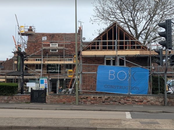
The White Horse Public House on Ock Street is having a refurbishment, and as with all such refurbs they will be changing the sign.
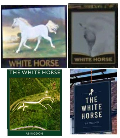
Over the past twenty years, the sign has evolved from a running horse, to a white horse head silhouette, and then to the carved chalk horse on the hill over Uffington after which our district council is named. The current proposal shows a small rearing white horse icon with larger text.
The design is now going through the planning process, where the heritage officer has raised concerns about the balance of the sign. With other signage on the building already relying on ‘THE WHITE HORSE’ text, the officer suggests a more traditional hanging sign – with a larger image and more modest lettering – would better suit the pub. A local resident made the same point.
I quite like the running horse – that is, the Uffington version. It has the merit of referring to our local geographical heritage.
The ‘current proposal’ reeks of ‘corporate cost considerations’ and it’ll be plastic pint glasses and piped music in the lavvies next if we’re not careful.
I liked the horse head shot best and I’m sure the artist who did the original Uffington horse wanted to do something like this, but the local council at the time said they couldn’t afford the chalk budget so he told them he’d only be able to do a pretty thin horse and all the bits wouldn’t necessarily be joined up.
When I was little it had a white heavy horse on one side and a white pony on the other.
Why would they have plastic pint glasses in the lavvies newcomer. Most pubs have urinals?
The plain writing one is so bland, like it’s trying to be some snobby Oxford shop, but looks like something that could be created in MS Word.
What’s wrong with a nice image on a pub sign?