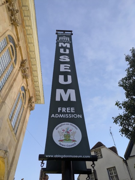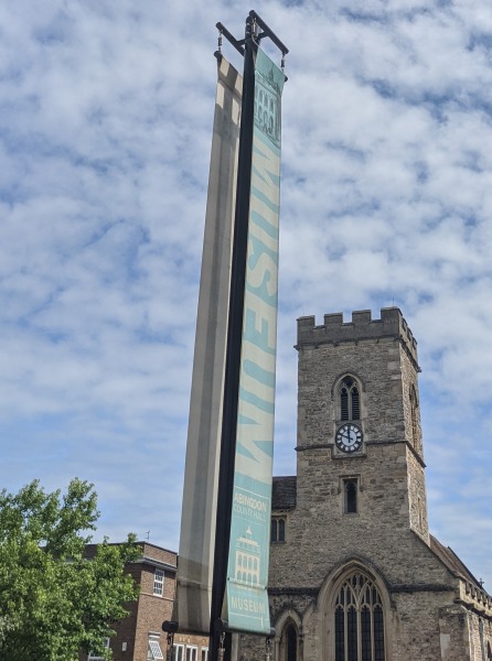
The museum banners on the Market Place have changed. The old sky-blue banners, in place since 2011, have now been replaced with deep green ones.
The new design features Abingdon-on-Thames Town Council’s colours and coat of arms, giving it a more formal look.

The previous banner had a lighter, airier look — echoing the blue of the sky, and blending with the background, but less easy to read.
On the old blue banner, ‘MUSEUM’ ran down the flag as one word. On the new green one, the letters are stacked, with the addition of “Free Admission” to make that clear.
What a mess….. Abingdon County Hall Museum Museum? The Town Council logo looks like it was made in WordArt and is completely out of place – They really need help with design and marketing.
I like it. Uncluttered basic details and easily read from a distance. To the point.
Yeah I agree. I guess design is subjective but much nicer than the pale blue thing I think
I think the new banners look great. Being a Grade 1 listed building there are onerous conditions which prevent almost anything being attached to the building and the banners will also have been subject to heightened planning controls being in the curtidge of the building.
Well done Abingdon Town Council.